
/Consultant-Image-Select-Resize-308-x-308px_20231525.jpg?width=308&height=308&name=Consultant-Image-Select-Resize-308-x-308px_20231525.jpg)

In this post, we explore the difference between warm and cool colours, and why this distinction matters when it comes to decorating your space.
Colours are divided into two main groups: warm and cool, as per the colour wheel.
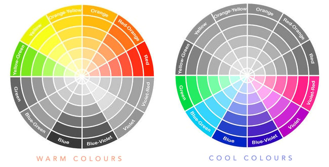
WARM COLOURS
The warm side of the colour spectrum consists of red, orange, and yellow. They are referred to as warm colours because of their association with fire, sunlight, and others sources of heat.
Psychologically, warm colours are more stimulating than cool ones and can heighten our emotional state. They’re often associated with emotions like passion and anger, and can be a source of stress for some.
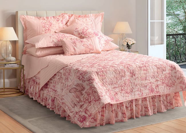
Warm colours are used to make spaces feel smaller and cozier. Visually, they have the effect of advancing toward us and closing in on us. If you want to make your space feel more homey and intimate, decorate with warm colours.
If you live in a cold climate, a decorating scheme dominated by warm colours will create a cozy refuge of warmth.
COOL COLOURS
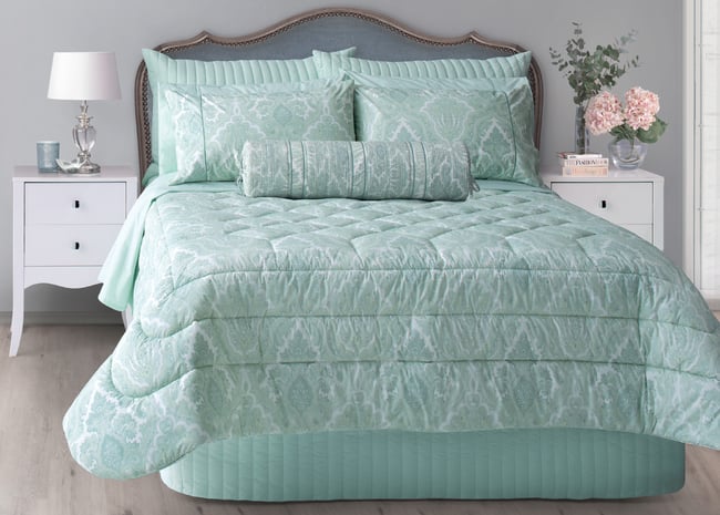
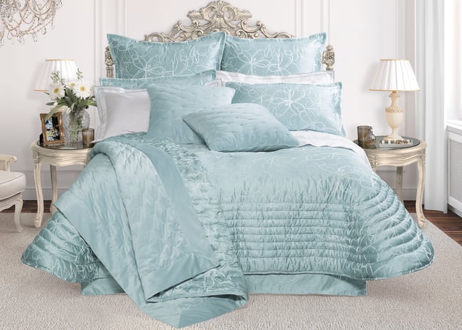
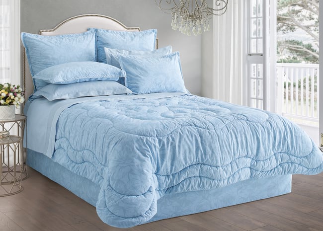
The cool side of the colour spectrum consists of blue, green, and light purple. They are referred to as cool colours because they remind us of naturally cool environments such as oceans, forests, and skies.
Psychologically, cool colours tend to calm and soothe us. However, cool colours can trigger depression and indifference in some.
Unlike warm colours, cool colours are used to make spaces feel a lot bigger than they are. Visually, cool colours recede into the distance and have an expansive effect. If you’d like to make a small space appear larger, decorating with cool colours can make it feel more spacious and open.
If you live in a very warm climate, a decorating scheme dominated by cool colours will create a sense of coolness and an escape from the hot weather.
BALANCE
Balance creates harmony in a space. Incorporate both warm and cool colours in your home décor for a cohesive colour scheme. You can achieve this look by adding a pop of warmth to a cool colour scheme, or cool accents to a warm colour scheme. This subtle contrast adds an element of interest and can prevent a space from becoming overwhelmingly warm and stuffy, or cool and bleak.
Think carefully about the mood you want to create before you decide on your colour scheme. Whether light and bright, or dark and cozy, knowing the difference between warm and cool colours is the first step towards achieving your interior design goals.
Pres Les luxury bedding and coordinates are available in stylish ranges of exclusive, guaranteed, high quality bedspreads, comforters, bed quilts, duvet covers, sheets, accessories, curtains, pillow and mattress protectors, pillows and duvets.
Sourced from the most respected design studios and textile manufacturers around the world, Pres Les offers a variety of luxurious styles to enhance your space.